

We created a questionnaire to ask 18 people what they thought of our documentary, radio trailer and newspaper advert. They then filled in our questionnaire and we analysed the results that we recieved.
Q1. On a scale of 1-5 (1 being the lowest and 5 being the highest) rate the following:
Informative: 1- 0 people, 2- 0 people, 3- 1 person, 4- 13 people, 5- 4 people
Entertaining: 1- 0 people, 2- 0 people, 3- 2 people, 4- 11 people, 5- 5 people
Obeying the conventions: 1- 0 people, 2, 0 people, 3- 1 person, 4- 11 people, 5- 6 people
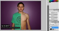
Q2. Would you agree that the newspaper advert is eye catching?
Everybody said they thought the advert was eyecatching
Some of their comments: They like the two sides of the body. However, they think the title doesn't stand out. They say its good that it makes people look and try to figure what its about. Also, the image is very striking
Q3. Do you think the sound levels are appropiate throughout the documentary?
12 people said they think the sound levels are appropiate.
5 people said the music is too loud especially on some of the voxpops and some people found it difficult to hear/understand the tattoo artist.
Q4. Would you say the mise-en-scene relates to the interviewee/ topic of the documentary?
Everyone agreed that the mise-en-scene relates.
Comments: It is relevant to the documentary and the background of Demi's interview reflects her personality.
Q5. Is there anything you would do differently with camera work or do you think it flows effectively?
Majority said it flows effectively.
Comments: Could have panned a little bit more. Continuity is good. Could have got shots of somebody getting a tattoo. Closer frames on voxpop. Lighting issues on some voxpops. Could be more creative. Good archive footage and camera work.
Q6. As a whole, would you say the editing and cutaways work well or do they need to be altered?
Everyone thought the editing and cutaways were appropiate.
Comments: Some cutaways are shown twice. Transitions work well between the cutaways. Cutaways are relevant with the voice over.
Q7. Do you think the music bed is useful throughout the documentary?
Again, everyone agreed that the music bed is useful
Comments: Some people like the way the lyrics doesn't distract the audience. Music made it more interesting. It suits the documentary. Its fun and creative.
Q8. Whilst watching the documentary, were you able to follow the narrative clearly?
Everyone said they were able to follow the narrative clearly and some people commented o the voice over saying it help stick the narrative/documentary together.
Q9. Does the radio trailer/ newspaper advert grab your attention and make you want to watch the full documentary?
Comments: Can't see the logo on newspaper advert, its too dark. They both make people interested in the topic. Advert is eye catching and the trailer is informative. The advert looks real and professional. The radio is more interesting than the advert.
http://www.youtube.com/watch?v=GiMrmggqerA

Q1. On a scale of 1-5 (1 being the lowest and 5 being the highest) rate the following:
Informative: 1- 0 people, 2- 0 people, 3- 1 person, 4- 13 people, 5- 4 people
Entertaining: 1- 0 people, 2- 0 people, 3- 2 people, 4- 11 people, 5- 5 people
Obeying the conventions: 1- 0 people, 2, 0 people, 3- 1 person, 4- 11 people, 5- 6 people
Q2. Would you agree that the newspaper advert is eye catching?
Everybody said they thought the advert was eyecatching
Some of their comments: They like the two sides of the body. However, they think the title doesn't stand out. They say its good that it makes people look and try to figure what its about. Also, the image is very striking
Q3. Do you think the sound levels are appropiate throughout the documentary?
12 people said they think the sound levels are appropiate.
5 people said the music is too loud especially on some of the voxpops and some people found it difficult to hear/understand the tattoo artist.
Q4. Would you say the mise-en-scene relates to the interviewee/ topic of the documentary?
Everyone agreed that the mise-en-scene relates.
Comments: It is relevant to the documentary and the background of Demi's interview reflects her personality.
Q5. Is there anything you would do differently with camera work or do you think it flows effectively?
Majority said it flows effectively.
Comments: Could have panned a little bit more. Continuity is good. Could have got shots of somebody getting a tattoo. Closer frames on voxpop. Lighting issues on some voxpops. Could be more creative. Good archive footage and camera work.
Q6. As a whole, would you say the editing and cutaways work well or do they need to be altered?
Everyone thought the editing and cutaways were appropiate.
Comments: Some cutaways are shown twice. Transitions work well between the cutaways. Cutaways are relevant with the voice over.
Q7. Do you think the music bed is useful throughout the documentary?
Again, everyone agreed that the music bed is useful
Comments: Some people like the way the lyrics doesn't distract the audience. Music made it more interesting. It suits the documentary. Its fun and creative.
Q8. Whilst watching the documentary, were you able to follow the narrative clearly?
Everyone said they were able to follow the narrative clearly and some people commented o the voice over saying it help stick the narrative/documentary together.
Q9. Does the radio trailer/ newspaper advert grab your attention and make you want to watch the full documentary?
Comments: Can't see the logo on newspaper advert, its too dark. They both make people interested in the topic. Advert is eye catching and the trailer is informative. The advert looks real and professional. The radio is more interesting than the advert.
http://www.youtube.com/watch?v=GiMrmggqerA


